What percentage of users browse the web using their mobile phone, and how does it affect your ecommerce sales?

So, maybe you have an ecommerce store and you’re wondering what kind of user experience you are providing to your visitors. You may be wondering if people are browsing your online store using their mobile device or their laptop, and how does it impacts your sales.
We’ll begin by taking a look at some raw data followed by an analysis.

General web browsing statistics
What devices do people use to browse the web? Let’s take a look at December 2020 statistics for overall device usage.
United States:
- Mobile: 47.46%
- Desktop: 48.56%
- Tablet: 3.98%
Source: Statcounter.com
Worldwide:
- Mobile: 55.73%
- Desktop: 41.46%
- Tablet: 2.81%
Source: Statcounter.com
According to data available online, mobile browsing was significantly higher than desktop browsing up until April 2020, coinciding with the time when several US states issued stay at home orders in response to COVID. As a result, users have gone back in part to using their laptop or desktop computer to browse the web, splitting their time equally between their mobile phone and their computer.
This raw data, while very useful, doesn’t paint a complete picture of your online store’s real traffic however. Where your visitors come from (how they land on your website) will also impact the results. Next, let’s take a look at acquisition.
Acquisition: Where are your visitors coming from?
Unless your visitors manually type your website’s URL in their browser’s search bar, they usually come from somewhere. Maybe they’re searching for related products or services on Google Search, or maybe they’re browsing Facebook or Twitter when a link to your website pops up, either through organic sharing or paid advertising.
Depending on the provenance of your visitor acquisitions, your share of mobile vs desktop visitors will vary.
Let’s take a look at some more data for some of the most popular search engines and social networks:
Google Search
In the first quarter of 2020, 56% of Google search queries were performed on mobile devices
Source: Statista.com
Facebook
As of October 2020, 79.9% of Facebook users accessed Facebook only via mobile phone. Only 18.5% of users used both phones and computers, and only 1.7% used exclusively a desktop or laptop.
Source: Statista.com
Twitter
The last official number we could find dates back from 2015 when it was reported that 80% of Twitter’s users use a mobile phone to access the app or website. This number likely increased since then.
Source: Statista.com
Instagram, Snapchat, TikTok
Instagram, Snapchat and TikTok being mobile apps rely almost exclusively or entirely on mobile traffic.
Linkedin
57% of Linkedin users access the website from their mobile device.
Source: Linkedin.com
Youtube
As of 2019, 70% of total Youtube video watch time comes from mobile users.
Source: Variety.com
That’s a lot of mobile browsing! Taking this data into consideration, we can conclude that mobile traffic will likely account at least half (or more) of the visitors that land on your online store, unless you offer a product of service that is exclusively available on desktop.
Mobile-friendly design is not only a must, it’s an absolute necessity to ensure sales growth.
What should a good mobile ecommerce interface look like?
Creating a good mobile interface requires an understanding of basic web design principles. One of the primary challenges faced by web designers is that whereas desktop interfaces are horizontal, mobile interfaces are vertical. The designer or developer in charge of setting up an online store interface will have to adapt the content for these opposed formats and test the interface on various devices prior to live launch.
While mobile users are expected to scroll down the page more than desktop users, the content that is visible as soon as the page loads needs to be strategically planned to improve user experience and sales conversion. As a business, you only have a few seconds to retain your visitors’ attention once they land on your page. Statistics on how long users will stay on a page vary a lot depending if the page loading time is considered in the equation. A generally widespread consensus is 15 seconds, although we believe that this number is a very optimistic outlook. We expect visitors’ attention span to be much shorter based on our own analytics data.
For instance, if all a smartphone user sees upon landing on your website is your logo and an oversized banner with vague text and no call to action, they are more likely to leave quickly. On the other hand, if your products or services are clearly defined and visible to desktop AND mobile users, combined with quick loading times, you will increase your likelihood of capturing a sale.
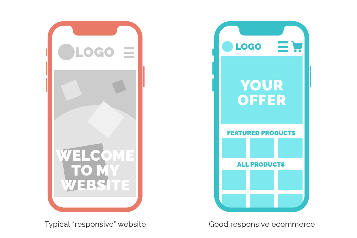
What most small business websites typically look like:
- No Cart or Checkout link or button in the header;
- Products or services nowhere to be seen on the front page;
- Unclear welcome message that does not describe what the site is about;
- Missing special offers and featured products or services;
- Images are usually not optimized for mobile speeds and can take a while to load;
- Large inconspicuous banner that takes up most of the screen.
What mobile ecommerce websites should look like:
- Navigation, Cart / Checkout should always be visible and easily accessible;
- Clear message and/or images that communicate what the website is about;
- Featured products, services and special offers when applicable;
- Optimized images and graphics that load quickly;
- Products are visible and near the top of the page rather than near the footer.

Other considerations for an optimal mobile user experience
Beyond constructing a great user interface that takes the user from point A to point B without any hiccups or confusion, these other important factors should be addressed when building an ecommerce website:
- Loading time: While home and office internet speeds are faster and more forgiving to image-heavy websites, on the go users who rely primarily on smartphones to browse the web experience a wide range of internet speeds depending on location and signal strength. To offset this discrepancy, your ecommerce website should be optimized for quick loading time on all mobile devices. This means optimizing images, enabling lazy loading, minifying your CSS and JS files, and having a great hosting provider.
- Smart checkout: Once a product has been added to the user’s cart, the checkout process should be swift and painless. Make sure the cart icon is always visible and accessible. In some cases, depending on the type of products or services you provide, you may even want to skip the cart entirely and guide your visitors towards checkout immediately.
- Easy search: Make sure your product catalog is user-friendly. Visitors should be able to find products quickly and easily. If your product catalog contains over a hundred items, enable a search bar and category search to help visitors find the products they are looking for. Organize your products in a way that will make sense to the average user, highlighting featured products and promotions near the top of the page.
- Monitor results: Always keep track of your analytics data to identify trends and problematic areas that need to be fixed. Are users dropping off when they reach a certain section of your website? Where do most buyers come from? How long does it take to checkout? How many users abandon their cart? These are all questions that can be answered through services like Google Analytics, Metorik, WooCommerce, etc.
Ecommerce can seem complicated, but they don’t need to be. If you need help understanding your visitors’ behavior to build a better mobile experience, reach out to us. We have over a decade of experience building websites for small and medium businesses like yours. The first consultation is always free.
Do you have an ecommerce that needs saving? You found your hero. Vervex helps business owners like yourself increase their online sales with better strategy, design and marketing.
Contact us to request a free consultation


